




















































Fabric Color Difference: Delta E and Print Approval Checks
Fabric color difference describes how a textile sample differs from an agreed colour reference under specified evaluation conditions. A Delta E value is useful only when its equation and measurement conditions are known. For printed cloth, also identify the region being compared: an aperture spanning several motif colours may answer a different question from a measurement of one plain area. Agree the physical standard, formula, sample presentation and visual review before using a number to approve bulk material.
This guide focuses on interpreting colour-difference records, particularly for patterned fabric. It does not provide a measured result for the illustrated cloth or a universal pass limit. Product photography helps identify the material and artwork, but it cannot establish a calibrated colour match across cameras, monitors and physical samples.
Start with an agreed physical colour standard
A colour name, screenshot or emailed photograph is a poor substitute for an identified reference. Record which physical standard the laboratory and supplier should use, its version and its intended material context. Protect the reference from conditions that could change its appearance and agree how a replacement will be approved if it is damaged or superseded.
For a print, retain the approved artwork and a physical strike-off where available. Separate the colour decision from motif size, registration and placement. A fabric can match one measured colour yet still have a visibly wrong pattern scale. It can also reproduce the artwork accurately while missing the required shade of a prominent printed region.
For the broader approval sequence, use Shengchao’s lab-dip-to-bulk colour workflow. The narrower task here is to make the measurement record interpretable, so that a number remains attached to the intended reference and comparison rather than becoming a detached pass badge.
Always name the Delta E equation
Delta E is not a complete specification by itself. Different equations describe colour difference differently, and a result should identify the calculation used. A tolerance agreed for one equation cannot simply be pasted onto another equation’s output because both columns happen to contain small decimal numbers.
The AATCC EP14 public summary covers CIEDE2000 and CMC colour-difference equations. It recommends CIEDE2000 as the primary method for instrumental evaluation, based on the evidence described in its scope. This does not create a universal textile acceptance limit: the buyer still needs an agreed tolerance and an appropriate evaluation programme.
Where CMC is specified, keep the chosen weighting parameters with the result. Where CIEDE2000 is specified, preserve the relevant calculation settings instead of recording only an abbreviated “DE.” If an older report lacks those details, request clarification rather than attempting to infer the formula from the numerical value.
| Record field | Why keep it? | Question to resolve |
|---|---|---|
| Reference identity | Defines the target | Which approved version? |
| Equation and settings | Defines the metric | Which Delta E? |
| Measurement setup | Supports comparison | Same geometry and presentation? |
| Print location | Defines the region | Single colour or mixed motif? |
| Decision rule | Defines acceptance | Agreed before evaluation? |
The table is a report-review checklist, not a test method. Obtain the laboratory’s complete procedure and customer requirement for the actual order.
Keep the measurement conditions together
Ask the laboratory to state the illuminant and standard-observer conditions used for the reported calculation. Also retain the instrument geometry, aperture and relevant treatment of specular reflection. These details help explain what was compared; a number without them is difficult to reproduce or compare with a supplier’s result.
The Australian Wool Textile Training Centre’s colour measurement in practice teaching resource discusses practical measurement and sample-presentation issues. Its educational context supports treating measurement setup as part of the record rather than an incidental instrument preference.
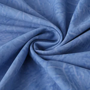
For a thin or translucent textile, agree backing and the number of layers used to present the sample. For a directional surface, agree orientation and repeat measurements. Do not fold one sample thickly while measuring another over a contrasting table and then attribute the entire difference to dyeing. Ask the laboratory which presentation is suitable for the particular cloth.
Define what a reading means on a multicolour print
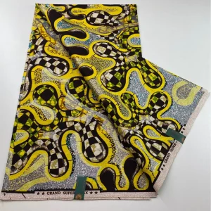
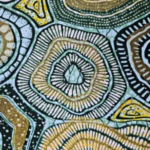
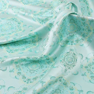
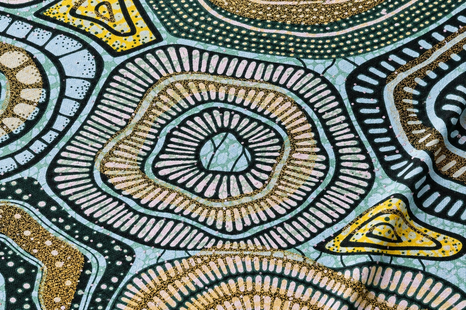
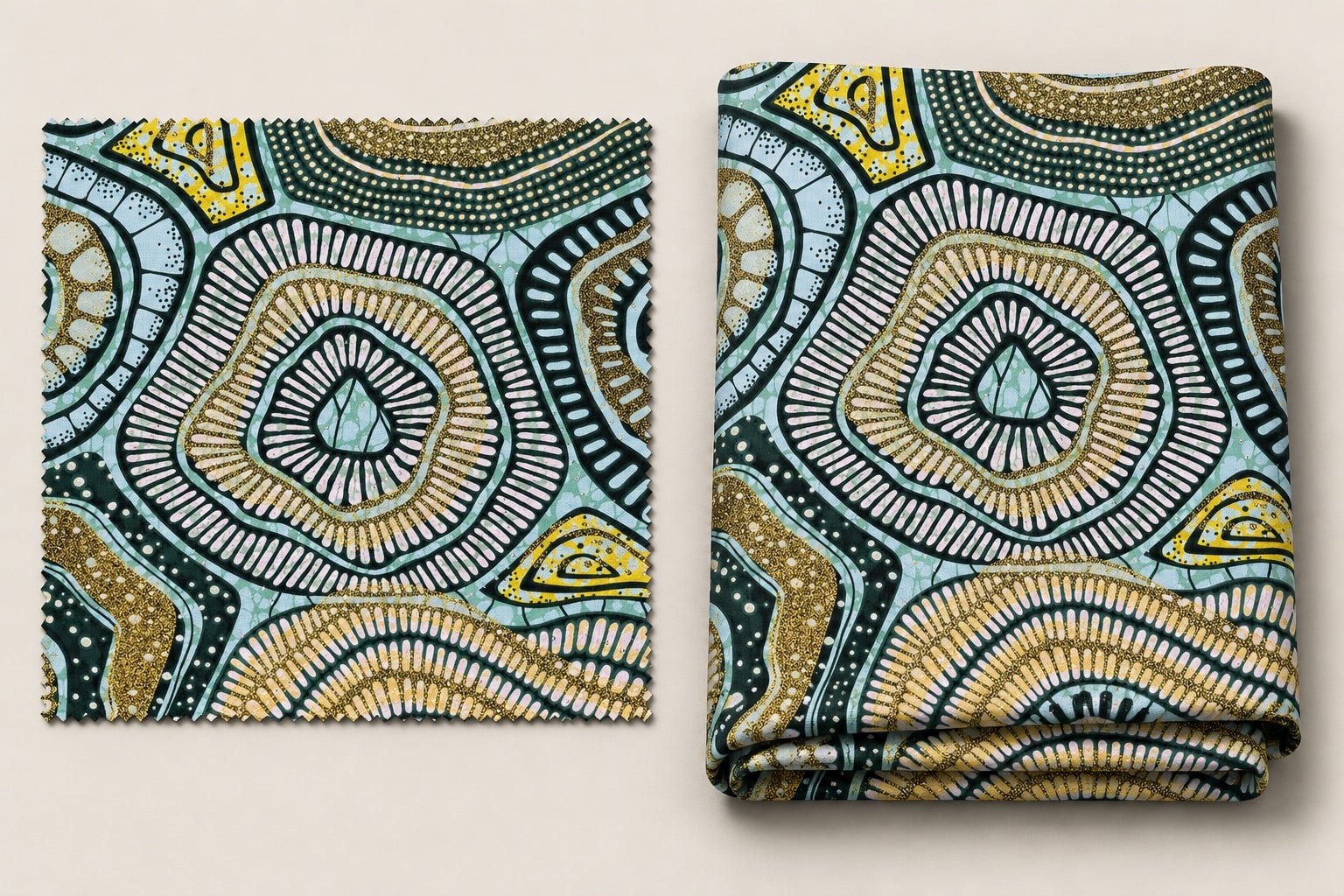
Shengchao’s cotton African-pattern fabric product page provides a relevant print-development reference. Its image shows aqua areas, dark curving bands, pale radial marks and yellow-gold-looking accents. The page title and listed printing process should be confirmed in the current specification; the photograph does not prove a particular wax process or metallic treatment.
For colour comparison, ask whether the instrument can isolate a sufficiently consistent region of the chosen motif. An aperture crossing dark outlines, pale ground and yellow detail measures a mixture of areas. Slight placement changes can alter that mixture even when the underlying printed colours have not changed. Document the region and positioning strategy before comparing batches.
If individual colour regions are too small for the proposed method, discuss an appropriate alternative with the laboratory and print developer. A controlled larger colour patch may support development if its relationship to the production print is explicitly agreed. It should not be presented as a direct measurement of every small detail in the finished artwork.
Read direction as well as the overall difference
An overall colour-difference value describes magnitude within its chosen system. It does not, by itself, tell a dyehouse or print developer what adjustment to make. Request the relevant component differences or supporting coordinates when those are needed to understand whether the sample differs mainly in lightness or another colour attribute.
Keep the reference and sample roles consistent. Reversing them can change the interpretation of signed component differences, even when a familiar total appears similar. Agree how the report presents its comparisons so that comments such as “lighter” or “redder” refer to the same direction throughout the approval conversation.
Never convert a laboratory colour-difference value into a percentage of colour accuracy. A statement such as “99% matching” is not established simply by subtracting a Delta E value from one hundred. Report the actual metric, conditions and agreed acceptance decision instead of inventing a marketing score.
Use visual review to address the actual appearance concern
Instrumental evaluation and controlled visual assessment should be planned together. Ask which viewing conditions matter for the intended product, and preserve the agreed comparison procedure. A difference that is acceptable for one end use may be objectionable when contrasting panels are assembled side by side or when a prominent motif appears repeatedly across a garment.
If two samples match under one light but separate under another, investigate the lighting concern rather than concealing it behind a single reported value. Record the conditions under which the concern occurs and ask the colour specialist to review it. Do not claim that one instrumental pass proves identical appearance under every possible light source.
For print approval, inspect colour alongside pattern scale, registration and overall balance. Separate these observations in the record. This allows the supplier to understand whether the concern is a shade mismatch, a print-placement defect or a different appearance issue requiring its own corrective work.
Keep initial shade matching separate from colourfastness
An initial match to an approved standard does not demonstrate durability after washing, rubbing or exposure. These are different questions with different specimens and assessments. A low initial Delta E value cannot establish that the print will retain its appearance after care or avoid transferring colour to another material.
The related colourfastness-to-washing guide explains change and staining after a specified care exposure. The rubbing colourfastness guide addresses transfer under rubbing. Keep their reports alongside the initial colour approval without merging the meanings of the results.
When a customer requests a before-and-after colour-difference assessment, identify the exposure, reference state and evaluation method explicitly. That comparison should not be confused with the original bulk-to-standard shade match. A clear report title prevents a treatment result from being reused as evidence for an unrelated comparison.
Build a report that another team can use
Record the fabric item, colourway, artwork version, lot, specimen position and physical reference. Attach the equation, settings, measurement presentation, observations and agreed decision rule. For print regions, include an unambiguous location description or a separate sampling map in the quality record. Keep these identifiers consistent with retained physical samples.
If supplier and buyer results disagree, check identities and conditions before assigning blame. Compare the same physical pieces where possible and discuss instrument setup, sample presentation and calculation settings. Preserve the discrepancy and its resolution. Replacing an unfavourable number with a different formula after testing can hide rather than solve a comparability problem.
Watch a university introduction to CIELAB
The following Universitat Politècnica de València lesson explains describing object colour in CIELAB space. It provides useful background for understanding colour coordinates. It is a general colour-science lesson, not a textile acceptance procedure or a claim about the illustrated print.
Frequently asked questions
Is there one Delta E limit for every textile?
No. Agree the equation, measurement conditions, intended use and acceptance rule with the relevant parties before testing.
Can CMC and CIEDE2000 numbers be compared directly?
Do not treat them as interchangeable. Preserve the named equation and its settings with the result and use the corresponding agreed tolerance.
Can one reading approve every colour in a print?
Not automatically. Define whether the measurement isolates one colour or covers several motif areas, and review the remaining colours and overall appearance separately.
Does a close initial colour match prove washing durability?
No. Initial shade matching and colourfastness answer different questions. Request the appropriate exposure assessment for durability claims.